HPRB Has Lengthy List of Critiques For McMillan Redevelopment

Courtesy of Vision McMillan
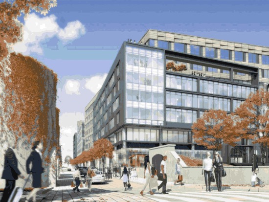
On Thursday, the Historic Preservation Review Board gave Vision McMillan Partners their remaining thoughts on the buildings proposed for the redevelopment of the McMillan Sand Filtration site. Two weeks ago, the development team went before the board to present plans for the buildings, which fall under four categories: the recreation center, the townhouses, a mixed-use apartment and grocery complex, and the medical office buildings. Though they relayed comments at the June meeting, the board gave the majority of their thoughts to the group on Thursday.
Overall, the board was unimpressed with the designs and charged the developers with coming back with a revision that addressed their many comments. In addition to a lack of coherence among the various buildings, which were designed by different architects, some board members felt that the historical elements of the site were not enough of a focal point.
“Let [the buildings] be unified and similar, and let the silos stand apart,” said one board member. “The new construction should be subservient to the historic assets,” reiterated another.

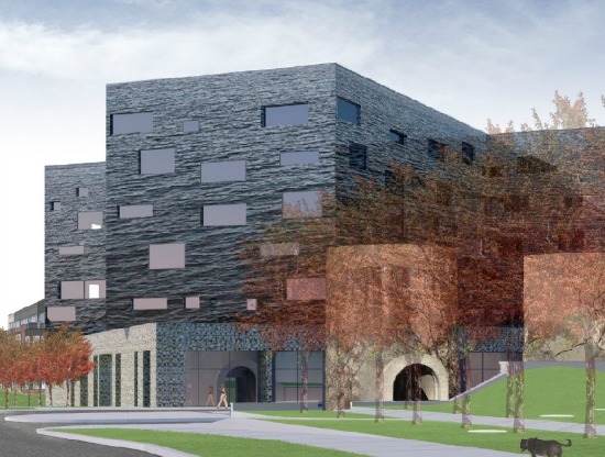
The mixed-use building.
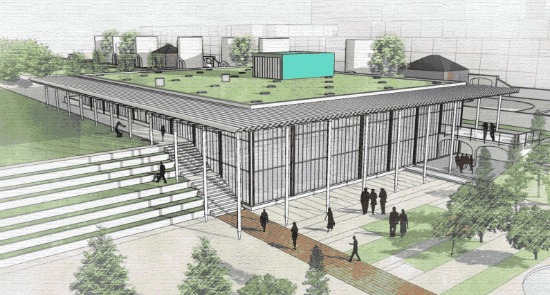
Several members of the board noted that the community center was the strongest of the four buildings proposed, while the mixed-use building, a cross-shaped structure with repurposed metal materials, was the most controversial. A few board members hinted that it was over-designed while others thought that it was conceptually strong, but didn’t approve of the shape and orientation.
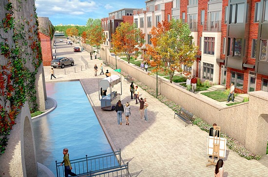
The townhouses generated little enthusiasm. The board offered a few ideas on how to improve the design, either by choosing materials more carefully, or perhaps creating groups of rowhouses with individual entries and simplifying the colors. “Instead of vertical row houses, what about grouped row houses with individual entry, and less color diversity,” Board chair Gretchen Pfaehler said.
The board voted to approve the master plan guidelines, but asked the applicants to come back with a revised design to address the litany of comments and criticism laid out at the meeting.
“I think this project points out how difficult it is to create a community from scratch,” noted Board member Graham Davidson.


1 comment:
Jeez. if i knew it was this easy to become an architect, I woulda left small engine repair behind in high school for math.
First, that black slag pile of a "multi use" building: I can just see a whole team of welsh miners living there....we can run our own coal fired power plant out of that building. Maybe they'll have running gun battles in front with the replicants that will inhabit the soulless "row house" development next door.
Oh, and why not a few more ROADs thru this industrial waste land?...CARS is what we need here! Yay! GREAT IDEA; REAL VISIONARY. Why not get some coal fired vehicles ready since we got aspect that covered already?
Let's talk real permeability: Why not also an airport in the middle of this thing?
Oh and "may i have some more cement please?" I mean it's ok if the temperature rises a few degrees since the rest of the development is so architecturally FRIGID.
Is this really what we've come to in this country? Think of some place you know that you remember because you thought was a special place. Question: did that place look like THIS? Of course it didn't. I'll tell you a place that looks like this: Connecticut and K street (for the offices) and Sursum Corda (for the "rowhouses").... tell me how special you think that is...not places you exactly want to hang out in at night.
This is not a place worth building or worth caring about. It is a NON place.
Post a Comment